Welcome, fellow React Native enthusiasts! Today, we’re going to delve into an incredibly powerful tool in the React Native arsenal – Flexbox. If you’ve been scratching your head over how to create perfect layouts in React Native, you’re in the right place. This guide will illuminate the path for you.
I remember when I first began my journey in mobile app development, the concept of layout design seemed so daunting. It felt like I was trying to piece together a puzzle without knowing what the final picture should look like. The day I discovered Flexbox, everything changed. Suddenly, I was no longer fighting against my layouts – I was in control. Now, I’m eager to share that power with you.
What is Flexbox?
Flexbox, short for Flexible Box Module, is a layout model in CSS3. It’s designed to improve the items’ alignment, direction, order, and size in the container even when their size is unknown or dynamic. The primary purpose of Flexbox is to provide a more efficient way to lay out, align, and distribute space among items in a container, even when their size is unknown.
In simpler terms, Flexbox is like the director of a movie. It tells every element on the screen where and when to move, ensuring that the overall picture (or in our case, the layout) remains harmonious and fluid. With Flexbox, you can control how your elements distribute space and align with each other, making it a powerful tool for creating professional and flexible layouts.
Why Use Flexbox in React Native?
React Native adopted Flexbox for layout design due to its simplicity and responsiveness. Unlike other methods, Flexbox layout logic works perfectly in a React Native environment because it’s designed for a dynamic and diverse world of various screen sizes and orientations.
Remember the joy when you built your first mobile app and saw it come alive on your phone? Now, imagine feeling that same joy when the app looks perfect on all devices and orientations. That’s the magic of Flexbox!
Now that we’ve laid the groundwork, let’s roll up our sleeves and dive into the world of Flexbox in React Native. By the end of this guide, I promise you’ll be able to craft beautiful, responsive layouts with ease and confidence. So, are you ready? Let’s get started!
Deep Dive into Flexbox Layouts
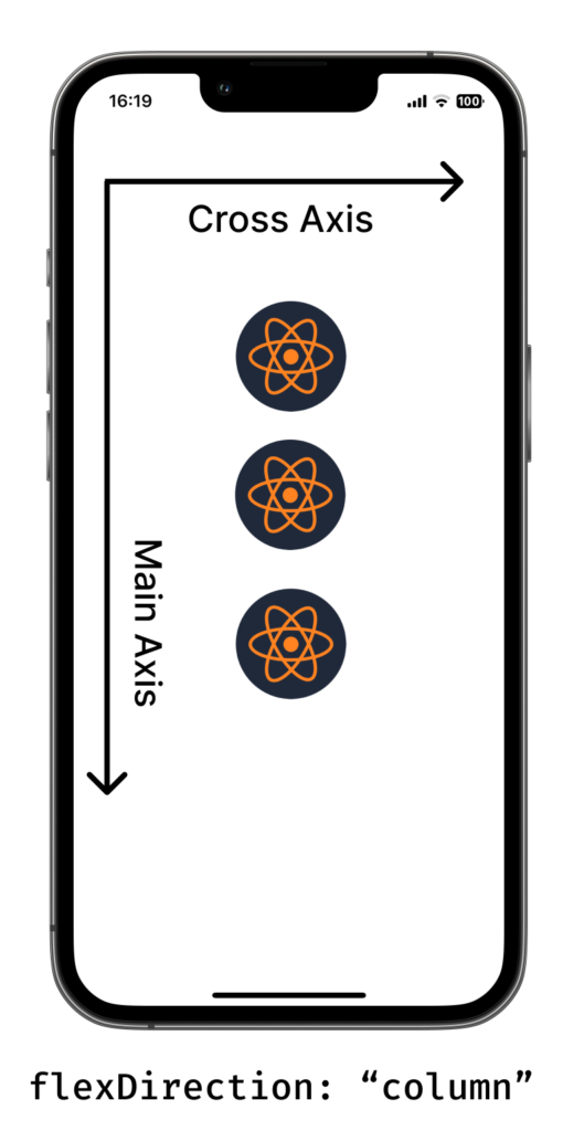
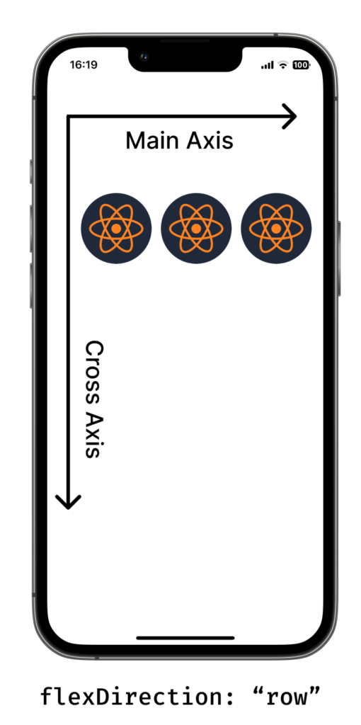
Understanding Main Axis and Cross Axis
Before we dive into the properties, let’s first understand the concept of the main axis and cross axis. The main axis is defined by the flexDirection property.
- If
flexDirectionis set tocolumn, your main axis is vertical. - If
flexDirectionis set torow, then your main axis is horizontal.
The cross axis, as you might guess, is perpendicular to the main axis. So, if your main axis is horizontal, your cross axis will be vertical, and vice versa.
I remember when I was first learning Flexbox, I used to get confused between the main axis and cross axis. To make it simpler, I visualized it as a crossroads:
The main road (or the main axis) is the direction we’re heading, and the side streets (or the cross axis) are what we cross along the way.
Flex Direction
The flexDirection property determines the direction in which our elements sit in the container. As mentioned, the default direction in React Native is column, which means items will stack vertically. But if we set flexDirection to row, they will sit next to each other horizontally, just like words in a sentence. Here’s a simple example:
<View style={{ flexDirection: 'row' }}>
   <ReactNativeCentralLogo />
   <ReactNativeCentralLogo />
   <ReactNativeCentralLogo />
</View>
This code will display the three items horizontally. If we change flexDirection to column, they would stack vertically.
By defaut, if we don’t specify a value to the
flexDirectionproperty, it is set to"column".
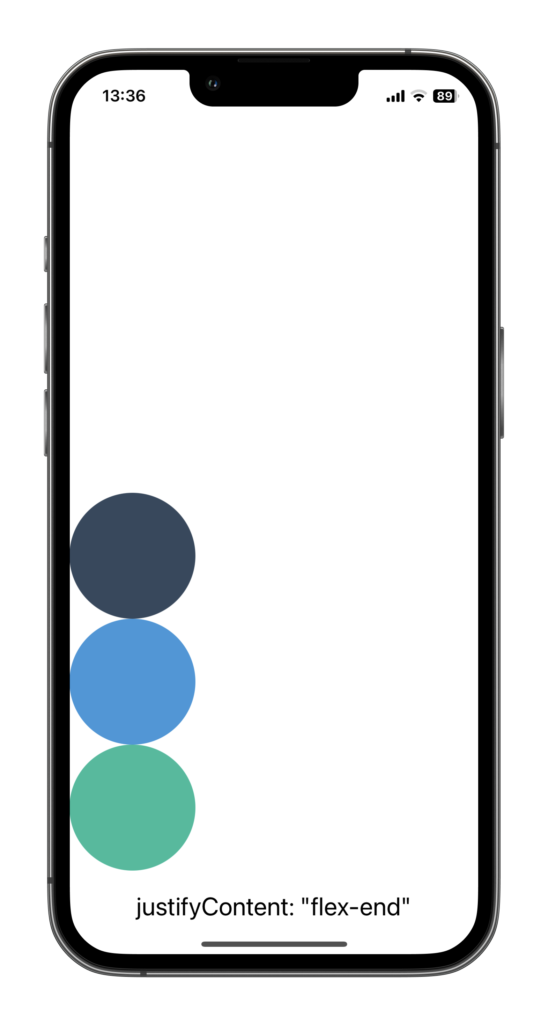
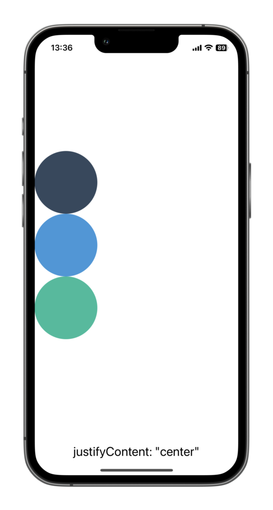
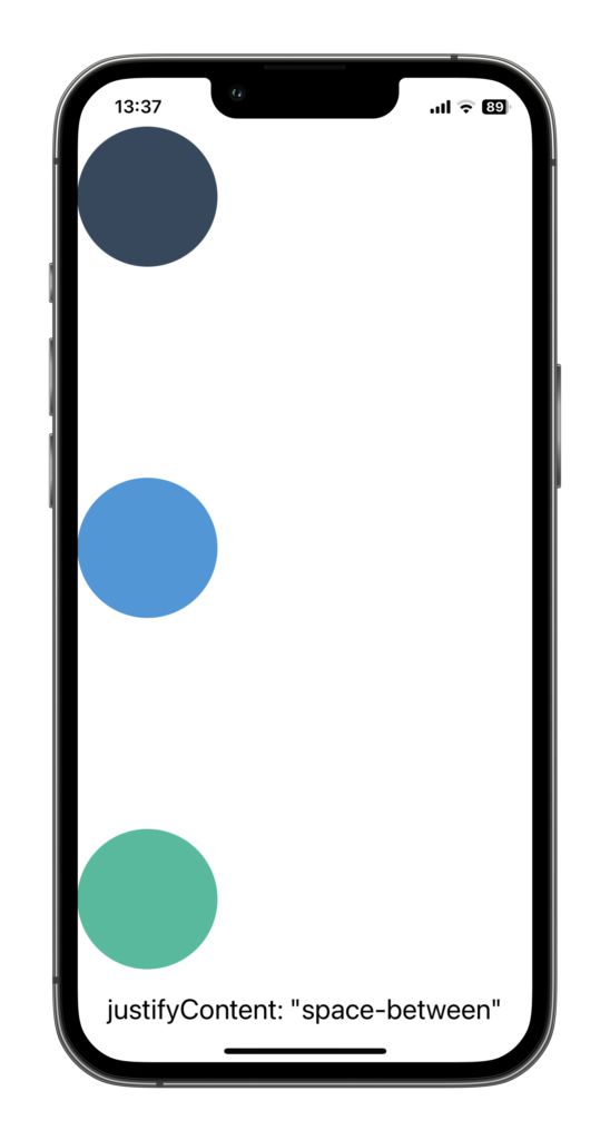
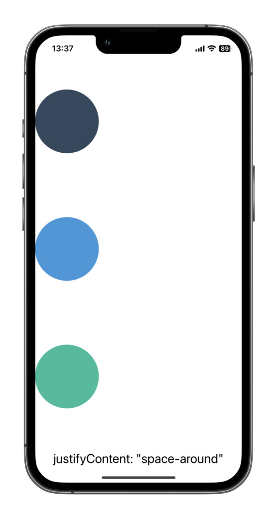
Justify Content
The justifyContent property allows us to distribute our items along the main axis. We can align them to the start, end, center, or spread them evenly across the main axis. The options are: flex-start, flex-end, center, space-between, and space-around. flex-start is the default value for the justifyContent
I like to think of justifyContent as a traffic controller, guiding the items along the main road. Let’s say we have a long road (main axis), and we want to control how our cars (items) are spread out on that road. That’s what justifyContent does!
Here’s how you can use justifyContent in a style:
<View style={{ flexDirection: "column", justifyContent: "space-between" }}>
  <Circle color="#34495e" />
  <Circle color="#3498db" />
  <Circle color="#1abc9c" />
</View>
Here is how the elements are displayed for each justifyContent value :

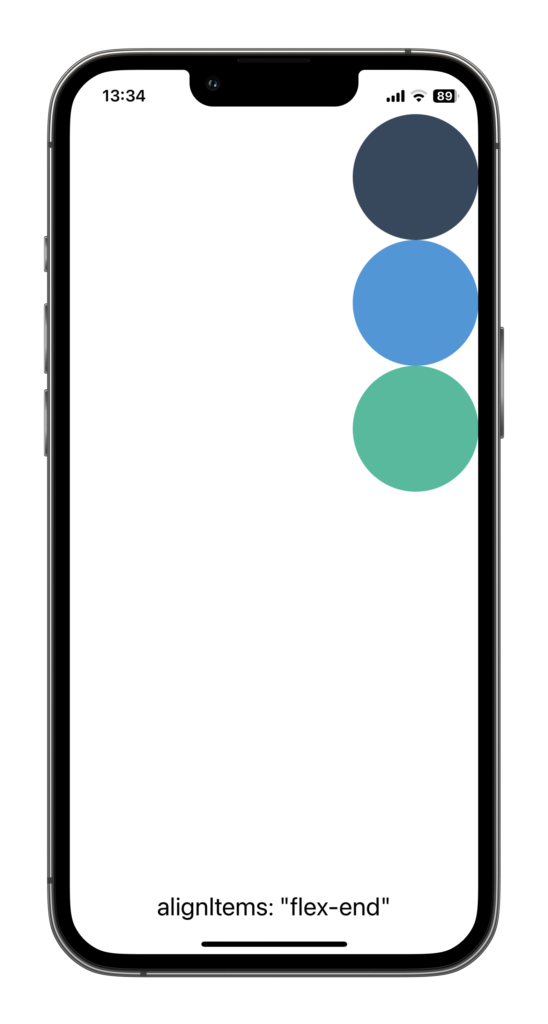
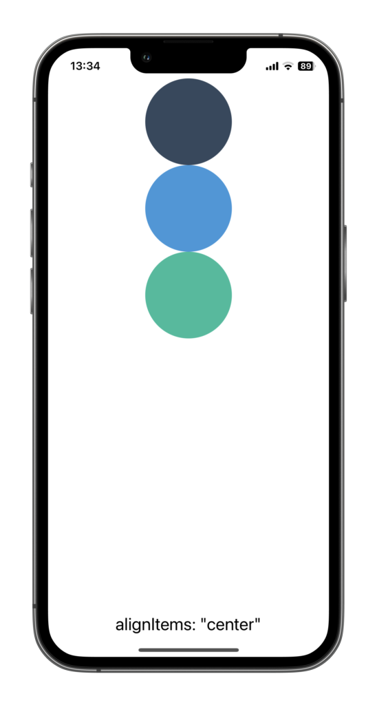
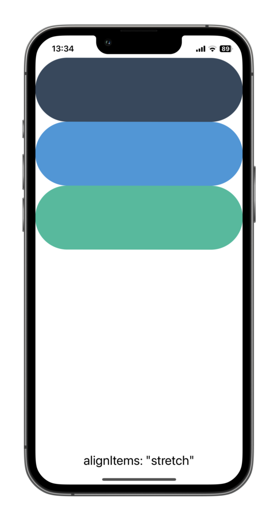
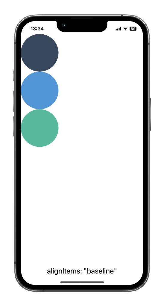
Align Items
The alignItems property is similar to justifyContent, but instead of distributing items along the main axis, it controls their alignment along the cross axis. The options are the same: flex-start, flex-end, center, stretch, and baseline. flex-start is the default value for the alignItems property.
Using the traffic controller analogy, if justifyContent is responsible for controlling how the cars move along the road, alignItems is like the lanes that the cars are in. It helps us decide if the cars should all be in the left lane, right lane, or spread out across several lanes.
Here’s how you can use alignItems in a style:
<View style={{ flexDirection: "column", alignItems: "center" }}>
  <Circle color="#34495e" />
  <Circle color="#3498db" />
  <Circle color="#1abc9c" />
</View>
Here is how the elements would be displayed for each alignItems value :

Align Self
The alignSelf property is a bit special. It allows you to override the alignItems value for specific items. So, if you want just one item to align differently from the others, alignSelf is your go-to property.
I remember one time when I was working on an app, all my items were perfectly aligned in the center, but I wanted one item to stick to the top. After a bit of head-scratching, I remembered alignSelf and was able to quickly fix it. It’s like having a special pass to break the rules!
Here’s how you can use alignSelf in a style:
<View style={{ flexDirection: "column", flex: 1, alignItems: "center" }}>
 <Circle color="#34495e" style={{ alignSelf: "flex-start" }} />
 <Circle color="#3498db" />
 <Circle color="#1abc9c" />
</View>
Here is how the first element would be displayed for each alignSelf value :
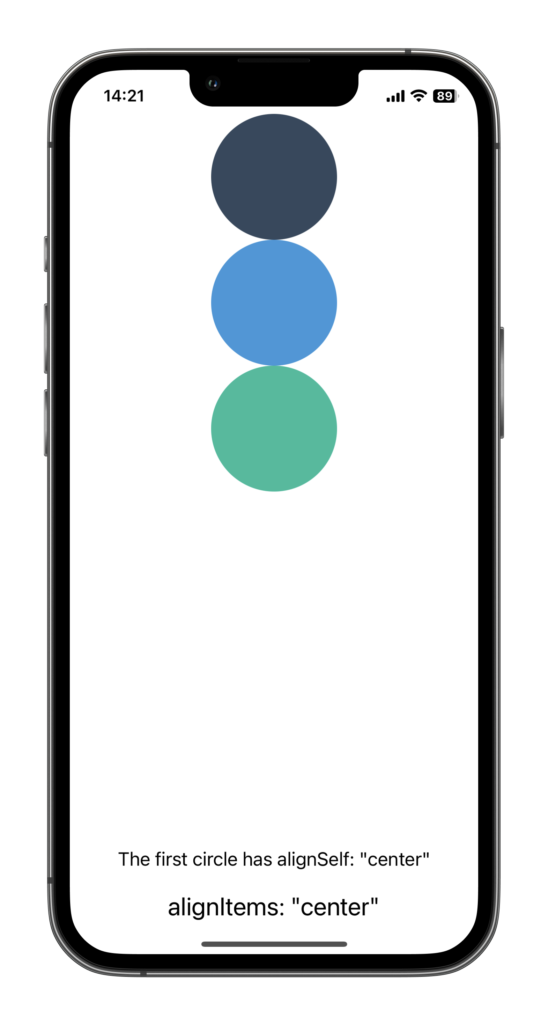
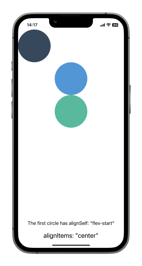
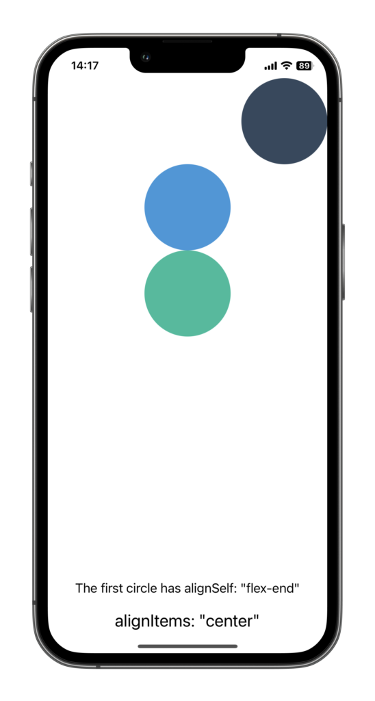
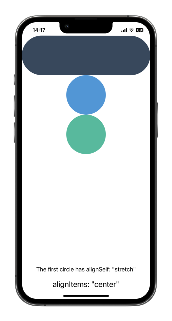

flexDirection is set to "column" and alignItems is set to "center"Flex Basis, Grow, and Shrink
Flex Basis
flexBasis is the initial main size of a flex item. It sets the default size of an element, before the remaining space is distributed according to flexGrow and flexShrink.
<View style={{ flexBasis: 50 }}>
  ...
</View>
In the above example, we’re setting the initial size of the view to be 50 units. This could be pixels, but it could also be a percentage of the container’s size.
Flex Grow
Next up, we have flexGrow, the property that controls how much a component should grow to fill any remaining space in the container.
<View style={{ flexGrow: 1 }}>
  ...
</View>
In this example, the view will grow to fill any remaining space in its container. If multiple sibling components also have flexGrow set, they will share the available space according to their flexGrow values.
Flex Shrink
This property determines how much a component should shrink if there’s not enough space in the container.
<View style={{ flexShrink: 2 }}>
  ...
</View>
In this example, the view will shrink at twice the rate of its siblings if there’s not enough space in the container. If flexShrink is set to 0, the component won’t shrink at all.
flexShrink is like the accommodating member of the trio, willing to step back and reduce its size to make room for others when the space is tight.
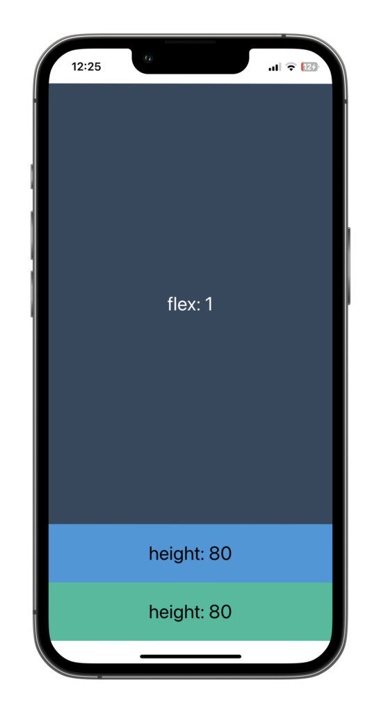
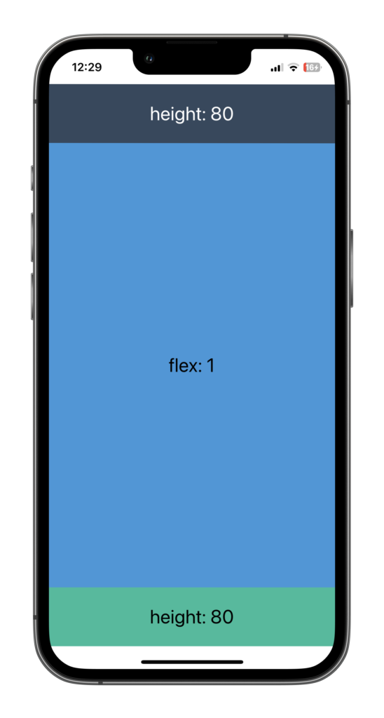
Flex
The flex property is a shorthand for three other properties: flexGrow, flexShrink, and flexBasis. You can think of it as the swiss army knife of Flexbox. With just this one property, you can control how a component grows, shrinks, and decides its base size.
<View style={{ flex: 1 }}>
  ...
</View>
When you’re writing {flex: 1}, it’s a shorthand way of saying “Hey, I want this component to grow to fill any available space, it can shrink if necessary, and it doesn’t have a preferred starting size before it grows or shrinks.” The 1 is actually setting the flexGrow property, and by default, flexShrink is set to 1, and flexBasis is set to 0.
Here’s a fun story from my early days of learning Flexbox: I was building an app with a sidebar and a main content area. I wanted the sidebar to stay at a fixed width, but the content area should fill the rest of the screen, no matter the screen size. My first attempt looked something like this:
const screenWidth = Dimensions.get('window').width

<View style={{ flexDirection: 'row', width: screenWidth }}>
  <View style={{ width: 120 }}>
    {/* Sidebar content */}
  </View>
  <View style={{ width: '???' }}>  // <----- screenWidth - 120 ???
    {/* Main content */}
  </View>
</View>
See the problem? I didn’t know what to put for the width of the main content. The problem with my first approach is that I was using relying on the Dimensions API. I scratched my head over this for a while. But then, I discovered the power of the flex property. Here’s how I solved it:
  <View style={{ flexDirection: 'row', flex: 1 }}>
    <View style={{ width: 120 }}>
      {/* Sidebar content */}
    </View>
    <View style={{ flex: 1 }}>
      {/* Main content */}
    </View>
  </View>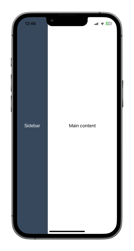
By setting flex: 1 on the main content view, I was telling it to grow and fill up any remaining space in the row. The sidebar stayed at its fixed width, and the main content gracefully filled up the rest of the space. It was a “Eureka!” moment for me. Using Flexbox principles is much simpler than coming with convoluted solutions involving the value of the screen width.
Note: If you are using the screen width value to build your layouts, you need to rethink your approach. Almost every layout can be built using Flexbox.
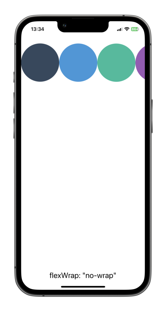
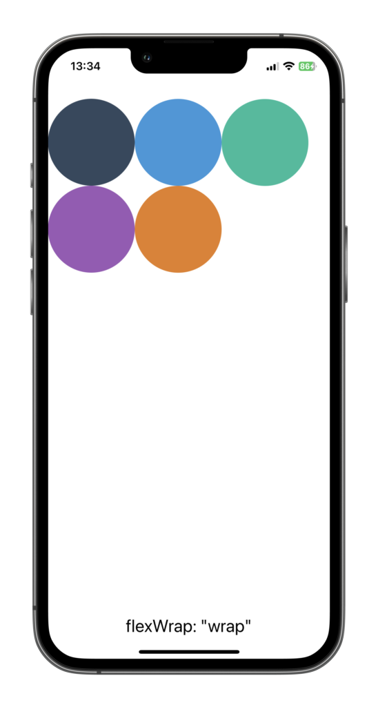
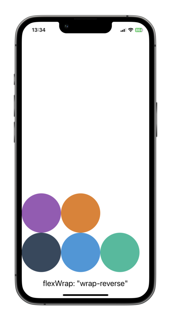
Flex Wrap
Think of flexWrap as the traffic officer of your Flexbox layout. It controls the flow of items in your container, guiding them where to go when there’s not enough room on one line.
By default, Flexbox wants to fit all your items on one line. It’s like that friend who insists everyone squeeze together for a group photo. But sometimes, we want our items to have a little more personal space, right? That’s where flexWrap comes in.
<View style={{ flexDirection: "row", flexWrap: "wrap" }}>
  <Circle color="#34495e" />
  <Circle color="#3498db" />
  <Circle color="#1abc9c" />
  <Circle color="#9b59b6" />
  <Circle color="#e67e22" />
</View>
In this example, we’re telling the container that it’s okay for the items to start a new line if they run out of room. They’ll flow from left to right, top to bottom (or right to left, bottom to top, depending on the direction property), creating new lines as needed.
The first time I utilized flexWrap, I was designing a photo gallery and wanted the images to wrap onto new lines when they ran out of space. I tried all sorts of complicated solutions, until I discovered flexWrap. I applied flexWrap: 'wrap' to my container, and voila! The images neatly arranged themselves into rows, just like I wanted. Game-changer.
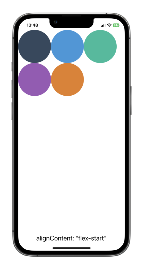
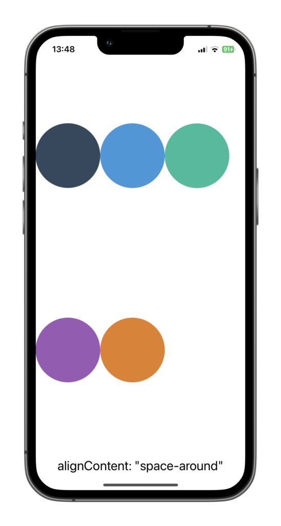
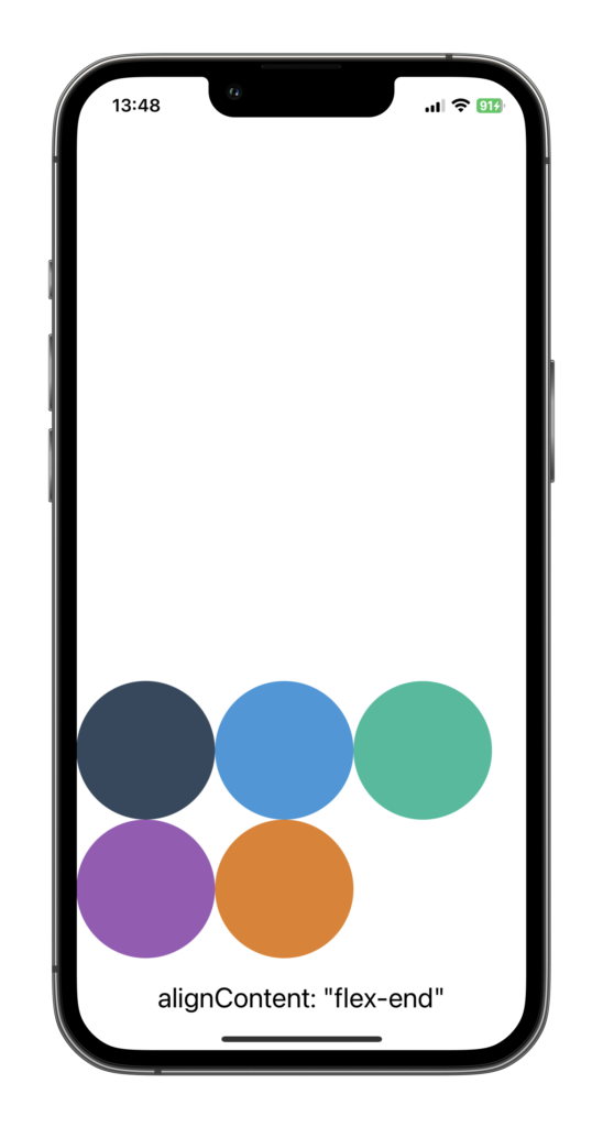
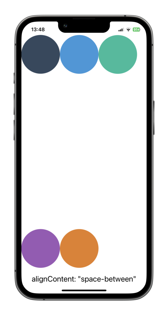
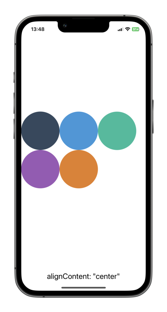
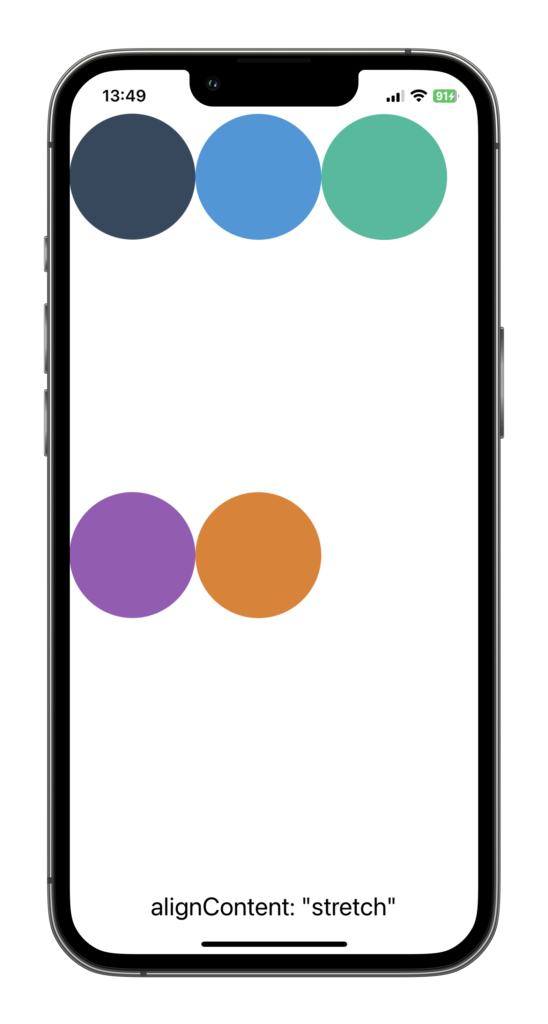
Align Content
The alignContent property helps us handle multiple lines of items in a flex container. Imagine you’ve got a bunch of items, all wrapped up onto multiple lines. alignContent helps you determine the spacing and alignment of these lines within the container.
Let’s see it in action:
<View style={{ flexDirection: "row", flexWrap: "wrap", alignContent: "space-around" }}>
  <Circle color="#34495e" />
  <Circle color="#3498db" />
  <Circle color="#1abc9c" />
  <Circle color="#9b59b6" />
  <Circle color="#e67e22" />
</View>
In the example above, we are telling the container to organize the children horizontally with flexDirection: "row", and with flexWrap: "wrap" we tell the container to wrap onto multiple lines (from top to bottom) if there’s not enough room to fit them all on one line. With alignContent: "space-around", we’re telling the container to distribute the available space around the lines, placing an equal amount of space at the end and the start of the lines, and in between them as well.
Building a Sample Application using Flexbox
Alright, enough theory. It’s time to get our hands dirty and start applying what we’ve learned. Nothing solidifies knowledge like practical application, and I’ve found that building a sample app is one of the best ways to fully grasp new concepts. So let’s dive in and create a simple layout using Flexbox in React Native!
Setting Up Our App
Before we start building, let’s first set up a new React Native application. If you’ve already created a new application in the previous steps, feel free to skip this part. If not, follow this guide to set up a new project on your computer or create a new playground on Expo Snack!
Creating the Layout
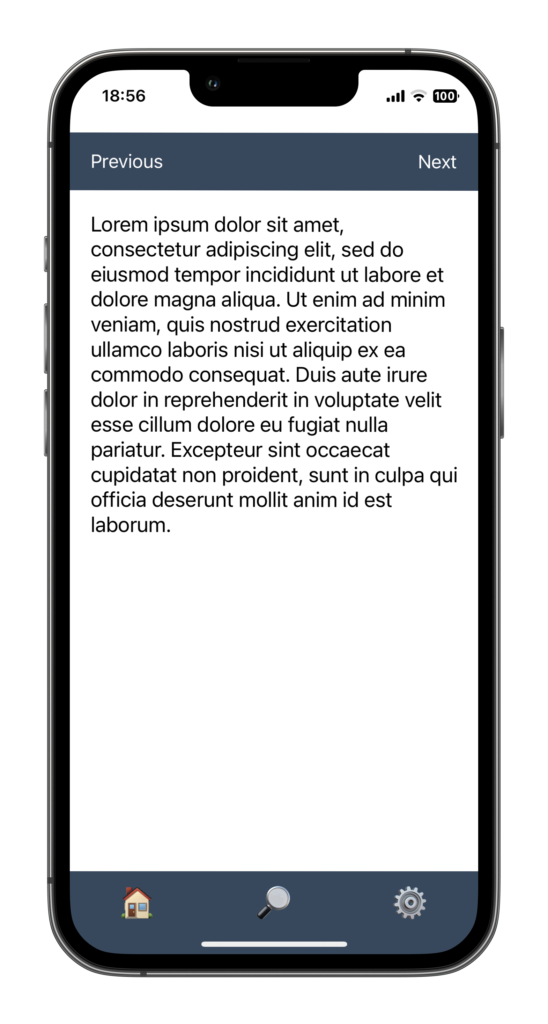
We’re going to create a simple layout that consists of a header, content area, and footer. Each section will contain multiple items that we’ll align using Flexbox.
- Header: Let’s create a header with 2 items aligned horizontally. We’ll use
flexDirection: 'row'to line them up side by side andjustifyContent: 'space-between'to ensure they are spread on each side of the header.alignItems: 'center'is using to keep the items vertically aligned in the header
<View style={{ flexDirection: "row", justifyContent: "space-between", alignItems: "center", height: 60 }}>
  <Text>Previous</Text>
  <Text>Next</Text>
</View>- Content: Now let’s create a content area. We’ll display some text and we want the content area to fill all the available space on the screen. We can achieve this by using flex: 1
<View style={{ flex: 1 }}>
  <Text>
    Lorem ipsum dolor sit amet, consectetur adipiscing elit, sed do
    eiusmod tempor incididunt ut labore et dolore magna aliqua. Ut enim ad
    minim veniam, quis nostrud exercitation ullamco laboris nisi ut
    aliquip ex ea commodo consequat.
  </Text>
</View>- Footer: Lastly, let’s create a footer with three items. We’ll center these items both horizontally and vertically using
justifyContent: 'center'andalignItems: 'center'.
<View style={{ flexDirection: "row", height: 60, justifyContent: "space-around", alignItems: "center" }}>
  <Text>🏠</Text>
  <Text>🔎</Text>
  <Text>⚙️</Text>
</View>
And there you have it, a simple layout using Flexbox! Feel free to play around with the properties and see how they affect the layout. Remember, the key to mastering Flexbox is practice and experimentation.
Here I shared the code in a Expo Snack Playground so you can try it yourself! Install Expo Go on you phone and scan the QR Code to run the app. I changed a few fontSizes and added backgroundColors and padding here and there to make it look nicer.
Common Pitfalls and How to Avoid Them
Like any new concept, mastering Flexbox in React Native can come with its own set of challenges. As a seasoned developer, I’ve faced In this section, I’ll share some common pitfalls I’ve encountered while using Flexbox and offer tips on how to avoid them.
Pitfall 1: Misunderstanding flexDirection
One common pitfall when starting with Flexbox is misunderstanding the flexDirection property in React Native. As I mentioned before, the default flexDirection in React Native is column, not row as it is in CSS3 on the Web. This can cause a bit of confusion if you’re coming from a web development background.
Solution: Be explicit with your flexDirection property. If you want a row layout, define flexDirection: 'row', and for a column layout, use flexDirection: 'column'. This will save you from unexpected results.
Pitfall 2: Neglecting the Cross Axis
Another common issue is forgetting about the cross axis. While justifyContent adjusts alignment along the main axis, alignItems adjusts alignment along the cross axis. I’ve seen many developers (myself included) getting frustrated when justifyContent didn’t align items as expected, only to realize we were trying to align items along the wrong axis!
Solution: Always consider the cross axis. Use alignItems to control alignment along the cross axis and remember that the cross axis is perpendicular to the main axis defined by flexDirection.
Pitfall 3: Forgetting flexWrap
By default, Flexbox will squeeze all elements into a single line. This can cause elements to shrink or even disappear if there’s not enough space. Forgetting to add flexWrap: 'wrap' when needed is a common oversight.
Solution: When dealing with multiple items that you want to wrap onto the next line when space is limited, remember to use flexWrap: 'wrap'.
Pitfall 4: One Size Does Not Fit All
Flexbox is incredibly powerful and versatile, but it’s not always the right solution for every layout. Sometimes, other layout methods may be more appropriate.
Solution: Always consider the nature of your layout before choosing Flexbox. Other layout options such as absolute positioning or using a combination of layout methods can sometimes provide a more efficient solution.
Pitfall 5: Overcomplicating Layouts
Flexbox makes it easy to create complex layouts, but this can sometimes lead to overcomplicated and hard-to-maintain code. I’ve often found myself twisting and turning with Flexbox to achieve a certain layout, only to realize there was a much simpler solution.
Solution: Try to keep your layouts as simple and clean as possible. Use Flexbox properties wisely and avoid unnecessary nesting of Views where possible. Remember, the best solution is often the simplest one.
Flexbox Best Practices
Now that we’ve covered the basics of Flexbox and learned how to avoid some common pitfalls, let’s move on to some best practices. These tips will help you write cleaner, more efficient code and maximize your use of Flexbox in React Native.
1. Keep It Simple
As I mentioned earlier, one of the greatest advantages of Flexbox is its ability to create complex layouts. But with great power comes great responsibility. It’s easy to get carried away and end up with overly complex and hard-to-maintain layouts. Always strive for simplicity. If a layout can be achieved with fewer nested Views and fewer Flexbox properties, go for the simpler option.
2. Plan Your Layouts
Before you start coding, take a moment to plan your layout. Sketch it out on paper if you need to. Identify the main axis and cross axis, decide how items should be distributed and aligned, and think about whether any items need to be aligned differently from the rest. This planning phase can save you a lot of time and frustration later on.
3. Use flex: 1 Wisely
The flex: 1 property is incredibly useful. It tells a component to fill all available space in its container. But use it wisely. Not every component needs to fill up all available space. Sometimes, setting explicit widths and heights or using padding and margin can give you better control over your layout.
4. Test on Different Screen Sizes
One of the advantages of using Flexbox is its responsiveness. A Flexbox layout should adapt nicely to different screen sizes. But don’t take this for granted. Always test your layouts on different screen sizes to ensure they look as expected.
FAQ
Here are some frequently asked questions about using Flexbox in React Native:
Q1: What is the default value for flexDirection in React Native?
The default value for flexDirection in React Native is column. This means items will be laid out from top to bottom by default.
Q2: What are the possible values for alignContent and what do they do?
The alignContent property can take six possible values: flex-start, flex-end, center, stretch, space-between, and space-around. These values determine how the lines of items are spaced along the cross axis.
Q3: Can I use both rowGap and columnGap together?
Absolutely! Using rowGap and columnGap together allows you to control the spacing between rows and columns separately, giving you more flexibility in your layouts.
Q4: How does flexGrow differ from flexShrink?
flexGrow and flexShrink control how much a flex item should grow or shrink relative to the rest of the items in the container when there is extra space or when space is limited. flexGrow comes into play when there is extra space, while flexShrink takes effect when there is not enough space.
Q5: What is the difference between flexBasis and width?
flexBasis is similar to width (or height, depending on the flexDirection). However, it has a higher priority than width when determining the initial main size of a flex item before space is distributed according to flexGrow and flexShrink.
Q6: Can I control the direction of wrapping in flexWrap?
Yes, by combining flexWrap with flexDirection, you can control the direction of wrapping. For example, flexWrap: wrap and flexDirection: row would make the items wrap from top to bottom.
Q7: When should I use absolute and relative positioning in my layouts?
You should use absolute and relative positioning sparingly, as they can make your layouts less flexible and harder to manage. Generally, use them when you need to break out of the normal flow to position an item in a specific location.
Q8: How does flex shorthand property work with flexBasis, flexGrow, and flexShrink?
The flex property is a shorthand that sets flexGrow, flexShrink, and flexBasis in one go. The default value is 0 1 auto, which means flexGrow: 0, flexShrink: 1, and flexBasis: auto.
Q9: How can I vertically center items using Flexbox in React Native?
To vertically center items, you can use alignItems: 'center' if your flexDirection is row, or justifyContent: 'center' if your flexDirection is column.
Q10: What does alignContent do if there’s only one line of items?
If there’s only one line of items, alignContent has no effect. In this case, alignItems is used to control the alignment of items.
Q11: How does the gap property work when used with flexWrap?
When flexWrap is set to wrap, the gap property sets the spaces between the rows (vertical) and columns (horizontal). It’s a shorthand for rowGap and columnGap.
Q12: Are there any performance considerations when using Flexbox
While Flexbox is quite efficient for laying out items in a React Native application, complex nested Flexbox layouts could potentially impact performance. However, for the vast majority of use cases, these impacts are negligible. It’s always a good idea to test your application’s performance, especially if you’re experiencing any issues or if your layouts are particularly complex. Keep in mind that readability and maintainability of your code are also very important, and Flexbox can greatly assist with these aspects.
Conclusion
And there you have it, a comprehensive guide to mastering layouts with Flexbox in React Native. We’ve went from the basics of Flexbox, through building a sample app, and onto tackling common pitfalls and best practices. I hope you’ve found this guide helpful!
When I first started using Flexbox, it felt like trying to solve a puzzle with infinite solutions. But with time, practice, and a lot of trial and error, I started seeing the patterns and understanding the logic behind it. Now, Flexbox is an invaluable tool in my React Native toolkit.
So here’s to you, future Flexbox maestro! Keep flexing those layout muscles. Keep pushing those pixels. And most importantly, keep building amazing things with React Native.
Looking forward to seeing you in the next post!
To further your understanding of React Native, have a look at some of our other articles:
- 7 Essential JavaScript Concepts for React Native Beginners
- Debugging React Native apps like a Pro in 2023
- Getting Started With React : Your First Step Towards Mastering React Native
- How Long Does it Take to Learn React Native?
- React Native Best Practices in 2023
- React Native Essentials: How to Handle Touch events with Pressable
- React Native Essentials: How to use Flatlist
- React Native Essentials: Getting started with React Navigation
- React Native Essentials: How to use TextInput