Introduction
Hello there, fellow React Native enthusiast!
As an experienced React Native developer, I can’t stress enough how critical touch inputs are in mobile applications. They’re the primary form of interaction between users and their mobile devices. That’s why it’s so important to get them right.
If you’re new to React Native or just want to deepen your understanding of it, you’re in for a treat. Today, we’re going to talk about one of the most crucial components in the React Native universe – Pressable.
When I first started with React Native, I was a bit overwhelmed by the sheer number of components and APIs it offered. There’s a component for almost everything! But as I dug deeper, I discovered that some of these components are real game-changers. Pressable is definitely one of them.
Pressable is a Core Component wrapper that can detect various stages of press interactions on any of its defined children. It’s like a super-smart button that not only knows when it’s pressed but also when the press is activated, deactivated, or even if it’s a long press.
Here’s a simple example of how it works:
<Pressable onPress={onPressFunction}>
  <Text>I'm pressable!</Text>
</Pressable>
Looks pretty straightforward, right? Well, there’s a lot more to Pressable than meets the eye. By the end of this guide, you’ll have a deep understanding of this component and how to use it effectively to handle touch inputs in your React Native apps.
Understanding Pressable
Pressable is more than just a button. It’s a wrapper that can detect various stages of press interactions on any of its defined children. This means that you can wrap it around any React Native component and it will be able to respond to press interactions.
But how does Pressable achieve this? It uses React Native’s Pressability API, which provides a state machine for touch responses. This state machine defines a consistent set of interactions and responses to touch events.
When a user interacts with an element wrapped by Pressable, here’s what happens:
onPressInis called when a press is activated. Think of this as the moment a user’s finger first touches the screen.onPressOutis called when the press gesture is deactivated. This is when the user lifts their finger off the screen.
That’s not all. After pressing onPressIn, one of two things will happen:
- The user will remove his finger, triggering
onPressOutfollowed byonPress. - If the user leaves his finger longer than 500 milliseconds before removing it,
onLongPressis triggered.onPressOutwill be called when he remove his finger.
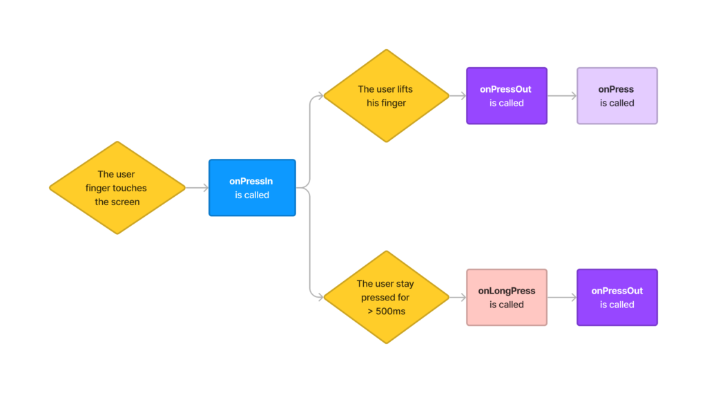
This sequence of events gives you fine-grained control over the user’s interactions with your app. You can customize your app’s response to each stage of a press interaction, allowing for a highly interactive and responsive user experience.
But what if a user accidentally activates the wrong element, or misses the activation area? Don’t worry, Pressable has you covered! It provides an optional HitRect you can use to define how far a touch can register away from the wrapped element. Presses can start anywhere within a HitRect.
Additionally, Pressable introduces a PressRect that allows presses to move beyond the element and its HitRect while maintaining activation. This is especially useful for maintaining the “press” even when sliding your finger slowly away from the button you’re pressing down on.

Now, you might be wondering how Pressable is different from other touchable components in React Native, like TouchableOpacity and TouchableHighlight. These components also respond to press interactions, right?
Yes, they do. But Pressable provides a more robust and flexible way to handle press interactions. While TouchableOpacity and TouchableHighlight are great for basic use cases, they may not provide the level of control you need for more complex interactions. Pressable fills this gap by providing a higher level of customization and control.
Using Pressable for the first time
Now that we have a solid understanding of what Pressable is and how it works, let’s roll up our sleeves and start using it in our React Native projects. If you’re following along on your computer, make sure you have your development environment set up and ready to go. If not, the React Native Environment Setup Guide is a great place to start.
Step 1: Creating a New React Native Project
First, let’s create a new React Native project. Open your terminal or command line and type in the following command:
npx react-native init PressableDemoStep 2: Implementing a Basic Pressable Button
Once the project is set up, navigate into your new project folder (PressableDemo) and open the App.js file. This is where we’ll implement our first Pressable component.
Replace the contents of App.js with the following:
import React from 'react';
import { Pressable, Text, StyleSheet } from 'react-native';

const App = () => {
  const onPressFunction = () => {
    alert('Button pressed!');
  };

  return (
    <Pressable style={styles.button} onPress={onPressFunction}>
      <Text style={styles.text}>Press Me</Text>
    </Pressable>
  );
};

const styles = StyleSheet.create({
  button: {
    backgroundColor: 'blue',
    padding: 10,
    borderRadius: 8,
  },
  text: {
    color: 'white',
    fontSize: 16,
    textAlign: 'center',
  },
});

export default App;
In this code, we’re defining a Pressable component with a child Text component. When the Pressable component is pressed, it triggers the onPressFunction, which in this case, simply displays an alert message.
You should now see a blue button with the label “Press Me”. Try pressing it. If everything is set up correctly, you should see an alert saying “Button pressed!”.
Congratulations, you’ve just implemented your first Pressable component in React Native!
Advanced Touch Handling with Pressable
The Pressable component in React Native is powerful and flexible, allowing us to handle touch events in more complex ways. In this section, we’ll look at a few examples of how you can use Pressable for advanced touch handling.
1. Long Press Actions
With the onLongPress prop, we can differentiate between a quick press and a long press. This is useful when you want to provide different actions based on how long the user presses the element. Let’s add a long press action to our button:
<Pressable
  style={styles.button}
  onPress={onPressFunction}
  onLongPress={() => alert('Long press detected!')}
>
  <Text style={styles.text}>Press Me</Text>
</Pressable>
In this example, a short press will trigger onPressFunction, while a long press will display a different alert.
2. Visual Feedback
With the style prop, we can change the appearance of the button when it’s pressed. Here’s an example:
<Pressable
  style={({ pressed }) => [
    styles.button,
    { backgroundColor: pressed ? 'darkblue' : 'blue' },
  ]}
  onPress={onPressFunction}
>
  <Text style={styles.text}>Press Me</Text>
</Pressable>
In this case, the button’s background color will change to ‘darkblue’ when pressed, providing visual feedback to the user.
3. Increasing Touchable Area
Sometimes, it’s useful to increase the touchable area of an element without changing its visual appearance. We can achieve this with the hitSlop prop. Here’s how:
<Pressable
  style={styles.button}
  onPress={onPressFunction}
  hitSlop={20}
>
  <Text style={styles.text}>Press Me</Text>
</Pressable>
Now, the touchable area of the button extends 20 pixels outside its visual boundaries.
4. Handling Hover States
On devices with a mouse or trackpad, we can provide hover feedback using the onHoverIn and onHoverOut props, or the hovered flag parameter given to the styles or children function. These props are affected when the mouse pointer enters or leaves the element.
<Pressable
  style={({hovered}) => [
    styles.button,
    {backgroundColor: hovered ? 'lightblue' : 'blue'},
  ]}
  onPress={onPressFunction}
>
  <Text style={styles.text}>Press Me</Text>
</Pressable>
In this example, the button’s background color changes to ‘lightblue’ when the mouse pointer hovers over it.
The Pressable component provides us with great flexibility in handling touch events. By understanding and leveraging its props, we can build a wide range of interactive elements for our React Native apps.
Most Useful Pressable Props
In this section, we’ll explore some of the most useful props that the Pressable component provides. These props give you granular control over how the Pressable component behaves in response to touch events.
Below, you’ll find a table that lists each prop, its type, default value (if applicable), and a brief description of its function.
| Prop | Type | Default Value | Description |
|---|---|---|---|
children | ReactNode or function | N/A | This prop accepts either React components or a function that receives a boolean reflecting whether the component is currently pressed. This is handy when you want to render different components or styles based on the press state of the Pressable component. |
delayLongPress | number | N/A | This prop allows you to customize the delay (in milliseconds) after press down before calling onLongPress. By default, the delay is 500 milliseconds. |
disabled | boolean | false | You can disable the press behavior of the Pressable component using the disabled prop. When this prop is set to true, all press interactions are ignored. |
hitSlop | object | N/A | The hitSlop prop allows you to set additional distance outside of the element in which a press can be detected. This is especially useful to increase the touch target of an element without having to change its layout and visual representation. |
onLongPress | function | N/A | The onLongPress prop is called if the time after onPressIn lasts longer than 500 milliseconds. This time period can be customized with delayLongPress. |
onPress | function | N/A | The onPress prop is called after onPressOut. This is the primary way to handle press events with Pressable. |
onPressIn | function | N/A | The onPressIn prop is called immediately when a touch is engaged, before onPressOut and onPress. |
onPressOut | function | N/A | The onPressOut prop is called when a touch is released. This marks the end of a press interaction. |
style | style or function | N/A | The style prop accepts either view styles or a function that receives a boolean reflecting whether the component is currently pressed and returns view styles. When using a function, this allows you to change the styles of the Pressable component based on its press state. |
android_ripple | object | N/A | This prop allows you to configure the ripple effect for Android. It accepts an object with properties like color, borderless, radius, and foreground, which define the color, border, radius, and layer of the ripple effect, respectively. |
Common Issues and Their Solutions
Touchable area too small
Problem: It’s often difficult for users to interact with smaller elements on the screen, particularly on smaller devices or for users with limited dexterity.
Solution: You can use the hitSlop prop to extend the touchable area of the Pressable component without changing its visual boundaries, making it easier to interact with.
<Pressable
  hitSlop={20}
  onPress={() => console.log('Pressed!')}
>
  <Text>Press Me</Text>
</Pressable>
No visual feedback on touch
Problem: Without any visual feedback, it can be hard for users to tell whether their touch inputs have been registered.
Solution: Use the style prop to change the appearance of the Pressable component when it’s pressed, providing immediate visual feedback.
<Pressable
  style={({pressed}) => [
    {backgroundColor: pressed ? 'darkblue' : 'blue'},
  ]}
  onPress={() => console.log('Pressed!')}
>
  <Text>Press Me</Text>
</Pressable>
See? The style prop accepts a function that returns styles. It receives the current state of the Pressable pressed and therefore you can change the appearance of the component to match the pressed state.
No differentiation between quick press and long press
Problem: Sometimes, you want to provide different actions based on how long the user presses an element, but the Pressable component only provides a single onPress prop by default.
Solution: Use the onLongPress prop to handle long press events separately from quick press events.
<Pressable
  onPress={() => console.log('Quick Press!')}
  onLongPress={() => console.log('Long Press!')}
>
  <Text>Press Me</Text>
</Pressable>
Press interactions are not disabled when necessary
Problem: There are situations where you need to temporarily disable press interactions on a Pressable component (for example, when a data fetch operation is in progress).
Solution: Use the disabled prop to disable all press interactions on the Pressable component.
<Pressable
  disabled={isLoading}
  onPress={() => console.log('Pressed!')}
>
  <Text>Press Me</Text>
</Pressable>
Conclusion
In this article, we’ve explored the Pressable component, a core feature of React Native that helps us handle touch interactions. We’ve learned about its various properties, and how we can use them to create unique user experiences. With examples, we’ve seen how we can use Pressable to handle complex touch interactions, such as long presses, visual feedback, and even increased touchable areas.
We’ve also addressed common challenges you may encounter when working with Pressable and offered solutions to these problems. Remember that the best way to learn and master React Native is through practice and application. Try using Pressable in your own projects, explore its capabilities, and see how it can enhance the interactivity of your React Native apps.
That’s it for now. I hope you found this article helpful. Don’t forget to share it with your friends and colleagues who are also learning React Native. Stay tuned for more articles on React Native! Cheers!
Have a look at some of our other articles:
- How Long Does it Take to Learn React Native?
- The Beginner’s Guide to Styling in React Native
- React Native Essentials: The Ultimate Guide to Flexbox
- React Native Essentials: Getting started with React Navigation
- React Native Essentials: How to use Flatlist
- React Native Essentials: How to use TextInput
- 5 Common useEffect Mistakes Every Junior React Native Developer Should Avoid